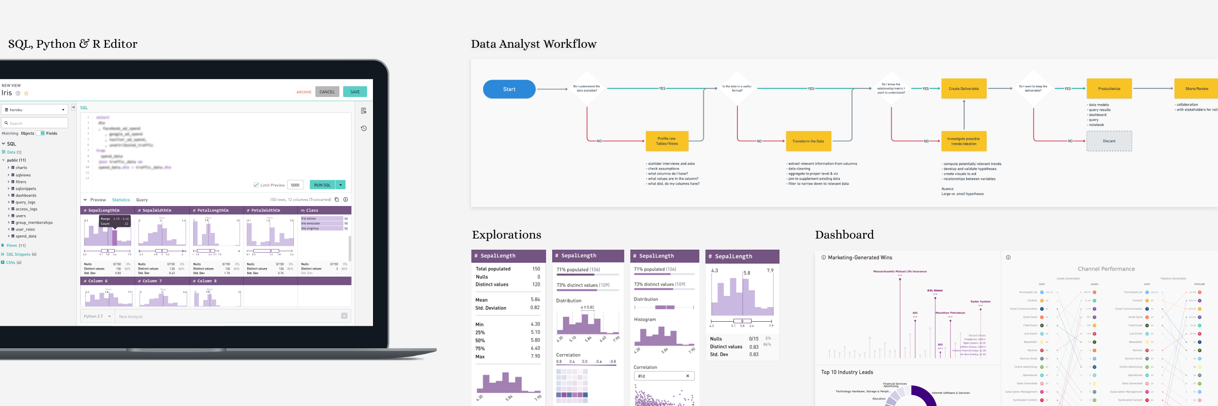
Crafting Data Analysis Experiences
Context
Periscope started with single language support (SQL) for analysis, a predominant language for modeling and analyzing data. Around late September 2017, we started hearing much chatter around R & Python. Our sales team was persistent that for more advanced analysis it would be valuable for the organization to invest in R & Python languages in addition to SQL.
Product & Marketing teams conducted a round of market research and concluded that advanced analysis languages were rapidly gaining mindshare in the analytical space. We wanted to be ahead of the game, and the product team decided to invest in R/Python.
Project Name: “Deep Analysis.”
Role
I was the lead designer for the project. I partnered with the Product Manager, Lead Engineer & SME’s to learn the details of Python & R. The product manager led the research and I conducted all the testing sessions.
Design kickoff was in Oct 2017, and I handed over the last of approved designs in Jan 2018. We shipped a fully functional feature in Feb 2018.
Needs
When talking to users, we heard two primary use cases for analyzing in R and Python,
Do more sophisticated calculation that can’t be done in SQL and
Create more specialized visualizations.
Both of these use cases were difficult or impossible to accomplish with workflows prevalent in the product. We needed a unifying goal to address these needs.
User Goals
Use R/Python visualization libraries to visually & statistically explore the data statistically.
Do supplemental statistical analysis that is hard to do in SQL (e.g. correlation, calculating test statistics)
Share the process and results of my analysis.
Put results back into the database (I've built a model, now I want it to go back into the database) and reuse (pull into other systems, or join to other data for reporting)
Pain Points
Manual processes were a headache
Getting data from the database to R/Python tools is often a manual process and is done very frequently, often multiple times for a single analysis.
Getting data from R/Python tools to the sharing platform or the database is a manual process.
Compliance & repeatability were difficult to achieve
Analyses are manually shared in different platforms and do not have a centralized location.
There is no process for ensuring all users use the same libraries for the same kind of analysis.
There is not a centralized place where models are stored and can be re-used in further analysis and for learning purposes.
Collaboration was difficult
Users share model results, visuals and code files to collaborate and verify work because there is no central system on which is runs while developing.
Uses paste screenshots to share to wider audiences because there is nothing else they can send them (e.g. to share it with an executive or a product manager).
Design Challenges
We wanted our solution to be unique to the Periscope platform and yet ensure that users feel they are working in a known environment.
We wanted to support IDE features and yet be contextually relevant.
We wanted to build a UI that was welcoming a broad spectrum of users, i.e. Beginners (only SQL) + Power users (R & Python).
On a personal note, this project was particularly challenging for me as I had no knowledge of Python & R.
I spent days with my lead engineer & in-house data analysts to understand the mindset and the context in which these programming languages are put to use for analysis purposes. One of the things I learnt from these interactions was to separate the nuances and technicalities of the code language from the workflows that users follow.
Design Process
Our engineering team had started working in parallel with the product & design team. I began with hi-fidelity prototypes to move fast and fail early.
E.g. Video Prototype Iteration
On one of our earliest interviews, I created a clickable prototype and made a screen recording. The output, a video, was then used to gather feedback. The response was excellent. Users felt very confident about pointing out the strengths and weakness of the solution. After that, I followed the same process for each iteration until the final solution.
User Testing Result Sheet
A slew of usability tests accompanied each iteration.
Test sheet was straightforward with no frills. Test areas were consistent throughout all iterations. With iterations, trends in the responses could be identified, and it brought clarity to the fields of improvement.
The above method changed the testing perception, from “do and ask” to “show and ask.”
Insights
I concluded the research & testing with some significant findings, which formalized the direction of the design.
highlights
SQL + Python/R Code Editor
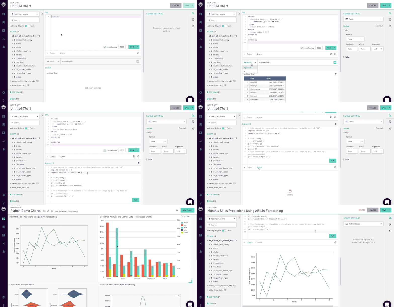
We maintained the original approach of having a SQL editor pane for authoring SQL queries as the necessary step one and added an optional step to append a code editor pane for additional analysis. This method supported the typical user workflow of selecting data from a database in SQL and passing it in as a data frame to R/Python for further processing.
Most IDE's have a combination of a code editor, build, execution & debugging tools. As this was the first step we were taking at introducing R/Py in the product, we wanted to communicate that our environment is capable, hardy and no different than other IDE's.
The UI structure of the code editor is core to the identity of Periscope, and we couldn't afford to deviate from the structure too far. This constraint posed an exciting challenge and condition to satisfy the desired user flow and meet expectations.
Python or R Code Editor seen below the SQL Editor
Sharing & Socializing
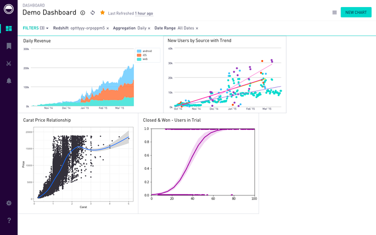
With the inclusion of Python & R into the code editor, our data analyst users could share the charts created on to the dashboards and seamless share them with peers and stakeholders. This guaranteed instant engagement and retention from our users in the tool, as they did not have to maneuver through 3 different tools for what periscope could do in a few clicks.
Python Code Editor
R Code Editor
R & Python Charts on Dashboard
Advanced Filtering
The advanced filtering mechanisms (seen in the right pane) allowed greater control over contextual visualization formatting. These advanced technical features were the backbone of the visualization capability, and it was imperative that we succeed in representing it in a way that flows naturally with the user tasks.
Data Analyst workflow improvement is an ongoing initiative for us. I meet and conduct design sprints with our in-house data team and other SME’s at regular intervals to make the product superior in technology and experience.
The two features listed below were the latest inclusions in the Advanced Analytics initiative.
Surfacing Errors & System Status
The tool was lacking a fundamental heuristic - there were no updates, system statuses provided to the users on the execution of code. Our user-facing errors also required substantial attention. I developed a framework for error messages and status updates for showcasing caching updates that helped Data Analysis stay aware of the state of work and thereby increase the transparency between users and the tool.
Timeline: Initiated - March 2018. Shipped - May 2018
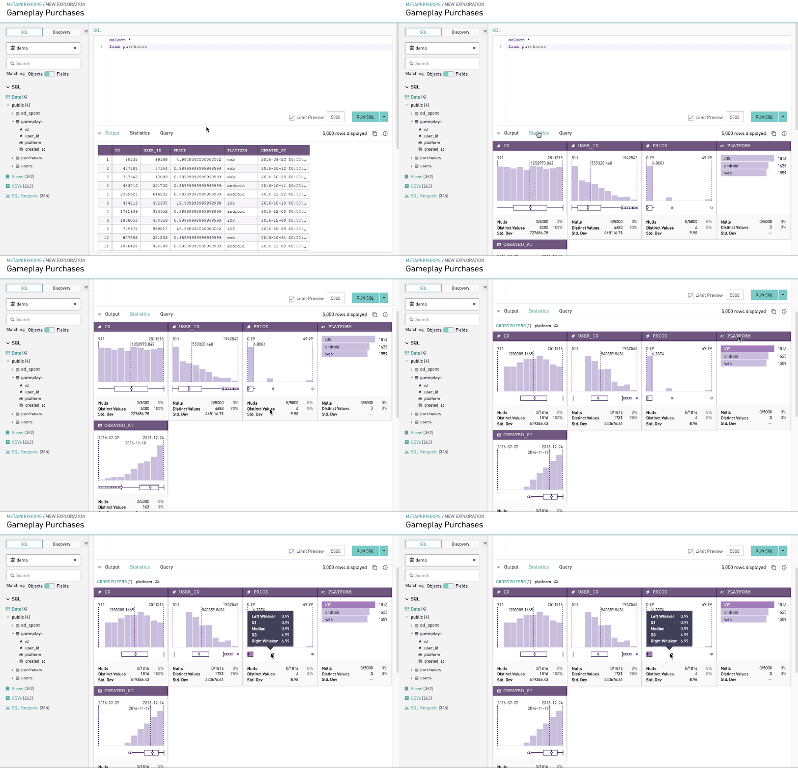
Advanced Analysis
Summary statistics gives data analysts quick insight into the shape of data that the query has returned. In other words, it was a technically advanced feature that would allow analysts to understand the shape of the data in a compelling visual format without writing multiple lines of code. Together with simple graphics analysis, they form the basis of virtually every quantitative analysis of data.
Timeline: Initiated- Jan 2019. Shipped - (v1) Feb 2019, (v2) April 2019
Learnings
Collaborating with PM’s and engineers closely on such a technically challenging project was very fruitful. Engineers went to great efforts to help the product team understand the nuances of different code editor environments. PM’s got involved with equal vigour and partnered with design to conduct many testing sessions.


